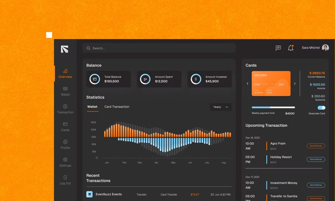
To make a dashboard app, start with the questions it needs to answer, choose a handful of metrics and define them, and connect the data behind them. Then describe the dashboard to an AI app builder or set it up in a no-code tool, pick the right chart for each question, make sure it loads fast and stays accurate, and decide who can see what before you share it.
Most teams already have the numbers they need. They're just spread across a CRM, a store, an ad account and three spreadsheets, and someone spends every Monday copying them into one place. A dashboard app puts those numbers in one view that updates on its own, shaped around the decisions your team actually makes. This guide covers when a dashboard app is the right tool and the seven steps from first question to rollout. If you're new to building with AI, start with how to build an app with AI.
TL;DR: How to make a dashboard app
List the questions the dashboard must answer, choose and define a few metrics, and connect your data. Build the dashboard, pick a chart that fits each question, make it fast and clearly dated, then set access and roll it out.
| Step | What you do | What the app builder handles |
|---|---|---|
| 01. Start with questions | List the decisions the dashboard supports | Nothing yet, this is your plan |
| 02. Choose metrics | Pick a handful and define each one | Nothing yet, this is your plan |
| 03. Connect your data | Import, connect or sync your sources | Data storage, imports and connections |
| 04. Build the dashboard | Describe the layout and views | Cards, charts, filters and pages |
| 05. Choose the right charts | Match each chart to its question | Rendering charts and tables |
| 06. Make it fast and trustworthy | Aggregate, paginate and date the data | Loading states and refreshes |
| 07. Set access and roll out | Decide who sees what, then share | Logins, roles and scheduled summaries |
Want to try it without code? Build your dashboard app with Base44.
Dashboard app, BI tool or spreadsheet?
There are three common ways to put numbers in front of a team, and each fits a different need.
| Spreadsheet | BI tool | Dashboard app | |
|---|---|---|---|
| Setup | Minutes | Connect a warehouse and model data | Describe or assemble the app |
| Best at | Quick, one-off analysis | Deep analysis by data teams | Everyday metrics for a specific team |
| Updates | Manual copy and paste | Scheduled refreshes | Live records or scheduled syncs |
| Actions | None beyond editing cells | Mostly view and explore | Can include forms, notes and approvals |
| Best for | One person, one question | Analysts and large data sets | Teams that check the same numbers daily |
A BI tool is the right choice when you have a data team and a warehouse full of history to explore. A dashboard app shines when a team needs the same handful of numbers every day, wants them next to the actions they take on them, and doesn't want to learn a BI tool. For a wider view of analytics tools, see business intelligence app development.
How to make a dashboard app in 7 steps
01. Start with the questions the dashboard answers
Don't start with charts. Start with the decisions people make and the questions behind them:
- Who looks at it? A sales lead, an ops manager, the founder, a client.
- How often? Every morning, in a weekly meeting, at month end.
- What do they decide? Where to chase deals, whether to reorder stock, which campaign to pause.
Write each question in plain words, like "Which deals are stuck in negotiation?" or "Are we on track for this month's revenue?" Every chart you add later should answer one of these.
Give every metric an owner and an action. If nobody is responsible for a number, or nobody would do anything differently when it moves, it doesn't belong on the dashboard. A short dashboard people act on beats a long one they scroll past.
02. Choose a handful of metrics and define them
Pick the five to eight metrics that answer your questions, then write a one-line definition for each:
- Name: "Monthly recurring revenue".
- Formula: sum of active subscriptions' monthly price.
- Source: the billing system.
- Period: calendar month, compared with last month.
- Owner: the finance lead.
Definitions stop the most common dashboard argument: two people quoting two different numbers for the same thing. Agree on them before you build, and show them on the dashboard, in a tooltip or a small info panel, so everyone reads the numbers the same way.
03. Connect your data
Your metrics need data, and there are three common ways to get it into a dashboard app:
- Data the app already holds. If orders, tasks or leads are managed inside the app, the dashboard can read them directly, live.
- Imports. Upload a CSV or Excel export from another tool to get started, or on a regular schedule.
- Connections. Link the app to the tools where data lives, such as a spreadsheet, your CRM, your store or a data warehouse, and sync on a schedule.
Many app builders offer ready-made connectors for common tools, often on paid plans, and some can query a data warehouse directly. Decide how fresh each metric needs to be. Revenue by month can sync once a day. Open support tickets might need to update every few minutes.
Keep one source of truth per metric. If revenue lives in your billing system, pull it from there, not from a spreadsheet someone updates by hand. Two sources for the same number guarantee they'll drift apart, and the dashboard loses credibility the first time they disagree.
04. Describe the dashboard to an app builder
With your questions, metrics and sources on paper, build the first version. With an AI app builder, you describe the dashboard the way you'd brief an analyst:
Build a sales dashboard for a 10-person team. Across the top, four cards: revenue this month vs last month, new deals this week, win rate this quarter and average deal size. Below that, a line chart of revenue by month for the last 12 months and a bar chart of open pipeline value by stage. At the bottom, a table of deals with no activity in 14 days, with owner and value. Add filters for date range and sales rep. Each rep sees only their own deals; sales managers see the whole team.
AI app builders such as Base44 turn a description like that into a working dashboard that reads from the app's live data, which you then refine in conversation. For sales-specific ideas, see sales app development.
05. Pick the right chart for each question
The chart should make the answer obvious at a glance:
- A single number that matters: a card with the value and its change from last period.
- A trend over time: a line chart.
- A comparison across categories: a bar chart, sorted from largest to smallest.
- Parts of a whole: a stacked bar. Avoid pie charts with more than three or four slices.
- Progress toward a target: a progress bar or a bullet chart.
- Details people need to act on: a table with sorting and a link to each record.
Keep the layout simple: the most important cards at the top, trends in the middle, detail tables at the bottom. Use one accent color for what needs attention and neutral colors for everything else, and add filters only for the questions people actually ask, like date range, team or region.
06. Make it fast and trustworthy
A dashboard that loads slowly or shows numbers people doubt stops being used. A few habits prevent both:
- Aggregate before you chart. Calculate totals and averages over your data rather than loading every row into the page.
- Page through large lists. Show detail tables in pages, not thousands of rows at once. Many builders limit how many records one request returns, so paging is a good habit anyway.
- Show loading and empty states. A clear placeholder while a chart loads, and a helpful message when there's no data yet.
- Date every number. Show when the data was last updated, especially for synced sources.
- Check a few numbers by hand. Before sharing, compare the dashboard with the source tool for last month.
A dashboard nobody trusts gets ignored. The first time a number looks wrong and nobody can explain why, people go back to their spreadsheets. Visible definitions, a "last updated" time and a quick spot-check against the source before you go live are what keep them using it.
07. Set who sees what, then roll it out
Decide access before you share the link:
- Team members see their own numbers, like their own deals, tickets or campaigns.
- Managers see their whole team.
- Leadership sees everything, including revenue and costs.
- Clients, if you share a reporting portal, see only their own account.
Apply the principle of least privilege: give each role only the data it needs, and test each role by logging in as it before you share it. Then roll out: walk the team through the dashboard in one meeting, run your next weekly review from it, and add a scheduled email summary for people who prefer the numbers in their inbox. Review the dashboard after a month and remove anything nobody uses.
Dashboard app examples
Sales pipeline dashboard
Revenue against target, pipeline by stage, win rate and stalled deals, with a filter per rep. Reps see their own pipeline, and managers see the team. A Monday email sends each rep their deals that need attention.
Marketing campaign dashboard
Spend, leads, cost per lead and conversions by campaign and channel, pulled from ad accounts and the CRM each morning. A red flag appears when a campaign's cost per lead rises above target. More ideas are in the guide to marketing app development.
Operations daily scorecard
Orders shipped, late orders, open support tickets and stock alerts on one screen for the morning stand-up, with drill-downs to the records behind each number. See operations app development for related tools.
Client reporting portal
An agency or service business gives each client a login to see their own results: work completed, hours used, key metrics and upcoming milestones. It replaces the monthly report PDF with a page that's always current. For finance-focused reporting, see finance app development.
Frequently asked questions
It depends on the route. BI tools usually charge per user per month and often need a data warehouse behind them. Custom development costs the most. Building with an app builder usually means a monthly plan, often with a free tier to start, with connectors to outside tools and scheduled automations on paid tiers.
Yes. No-code and AI app builders let you set up cards, charts, tables, filters and roles without writing code. With an AI app builder, you describe the dashboard in your own words and refine it in conversation until the numbers and layout are right.
Usually, yes. Many app builders can connect to spreadsheets, CRMs, stores and data warehouses, or import CSV exports. Check which connectors your builder offers and which plan they need, and decide how often each source should sync.
As often as the decisions it supports. Daily is enough for most revenue and marketing metrics, while support queues and operations boards may need updates every few minutes. Whatever you choose, show the "last updated" time so people know how fresh the numbers are.
A first working version can take hours with an AI app builder. Getting it ready for the team usually takes a few days to a couple of weeks, mostly spent agreeing on metric definitions, connecting data sources and checking numbers against the source tools.